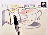
Although there are plenty of colorful env.'s out there, as well as being able to decorate your own, it's always fun to make envelopes, esp. if you have some lovely paper you want to use.
It's very easy to do. All you need is a template.
Making a Template:
You can either look online to print out a template (be sure to check postal sizes!) or make your own from an existing env. If using an existing env., carefully open to make sure you get it somewhat intact, so you can trace the flaps. Once you have the paper one cut out, copy on to some card stock, or even an empty cereal box, so it's more sturdy. (After cutting, I usually note the dimensions, just for inserts.)
Then, use your sturdy template to trace around the paper you wish to use. (Again, as mentioned in the Design & "Rules" page, make sure the paper isn't too cluttered looking.)
After cutting, use either a bone folder or popsicle stick (or anything that will help crease the flaps), take a straight edge and score where the flaps will fold. Be sure to fold in the side flaps first.
Once you have the creases folded, paste or tape the side and bottom flaps (but be careful not to paste to the inside of the env, if you are going to put a letter inside).
And that's it! Make sure the paper you use is a decent weight (ex/ most printer paper/recycled paper is too thin & flimsy).
Here are a few I've made over the years:


Scrapbook papers. The one on the right is rather busy with all the elements in the design. This might have worked better with a label or inside a clear env. (more on that below).
Halloween themed magazine pages. I do not recommend using magazine paper as 1) it's VERY flimsy and tears easily and 2) you need to use permanent markers/ink (waterproof), as the paper is very slick to write on. (I went through a phase with mag. pages b/c I kept "seeing" potential envelopes! But now I put them in clear env.'s)
Design-wise, these were actually perfect to use b/c they weren't too cluttered and there was plenty of clear space for the address.
A converted env., BUT too cluttered. I actually love this and think it's very pretty, but am hesitant to send. (You can see from the middle pic that it was a practice sheet where I wrote "the quick brown fox..." panagram.)
Now, THIS paper is PERFECT for handmade envelopes! No idea where I got it or when, but I'm so glad I didn't get rid of it, as I've used it several times for these Cmas themed env.'s
It's fairly thick, but yet still easy to fold. Plenty of clear space, depending on where the design lands.
Left: Had some fun with the "Have a Ball" stamps, so i printed out this scene from Happy Gilmore. Not the most ideal layout, but this was one of those exceptions. ;)
Right: Paper from the po catalogue. Although still slick, it's heavier than regular magazine paper.
Pretty Cmas wrapping paper. Now, wrapping paper can be fun, 1) if it's thick enough and not flimsy and 2) if the design isn't too cluttered. This one should have been placed in a clear env., as the stamp placement isn't ideal b/c of the design, and it would have covered the J of her name (which was part of the design). And then could have probably written the address in a horizontal manner vs. squeezing it in-between the holly.
Now, onto Clear Env.'s...
Clear Envelopes are great and perfect for busy designs. However, they too are slick, so you have to use waterproof permanent ink/markers, etc. To follow are some samples:
Left: Cmas magazine page. Right: Mum mag page to match stamp
Watercolor birds card (yes, I painted these!) This actually could be a "design" on an env. itself, as there is plenty of white space. But I decided to put in a clear env. just for fun. (Wish I had lettered her name differently -- not my best brush lettering.)
Left: this was a paper sample (you can see the details at the bottom) that I thought would make a fun card, as I love the design. So, I folded it in half and placed in a clear env. I was able to make letters for her name from the geometric nature of the design, and there was a decent amount of space for the address.
Right: This is such a lovely example (at first, I was a bit "fooled" as I thought she had sent me a sheet of stamps!) The paper dark paper becomes muted, and the address fit nicely between the "design" of the circles (or whatever they are).
This final sample is another magazine page. I had a little fun with the address, so to be safe, I added on extra postage (plus this butterfly stamp is so fun to use). I also posted a pic of the empty env., just so you could see. The trick is making sure things match up. (I should have put the state under to "O" in the city name.)


.jpg)


.jpg)
.jpg)

.jpg)

.jpg)


.jpg)
.jpg)
No comments:
Post a Comment
Note: Only a member of this blog may post a comment.