Monday, December 28, 2020

Cheers to Jean

 Am doing a semi-series of these envelopes (see Janet's Cmas one), and made one for Jean. 

Love how it turned out! (although the watercolors are metallic)

So mad... the Cheers bled! Don't know why as they're matching wc paper (but obviously the env. must be diff. from the card). Grrr. Sent anyway.


Family Cards (and ideas for next year)

I usually do a photo card and update that I send to family & friends, and try to letter all the same (not that they see them, but it saves time). However, depending on the name, sometimes the lettering style doesn't work. (see below)

This year, I did either red or blue brush lettering to match the stamp.


Do not like how Rodish turned out (too close together)

Close up of 2 better ones. On the top one, I messed up the c, so I tried to cover up to look like a snowflake.

This is one that didn't turn out, so I found another env. for the card, and lettered big. MUCH better! love it (except for the "off " lines)

Did a mock up for next year, as I plan to do most of them like this (if the name works, and depending on the stamp):


Saturday, December 19, 2020

Versals Tree to Jean


I LOVE this one I did for Jean. Was just playing with address layouts and decided to do an env. for her using metallic ink on black env.
At first, I did just red dots, but then added diff. colors to match the stamp. Used my pointed pen for the lettering and 3d stickers for the zip code numbers (and star).

Although it'd be fun to see how well and how long it would take to go through the system, I added her address to the side and back as well, to ensure delivery. Love how it turned out!

And here are her comments via email:  "thank you for the very pretty black envelope with the celebrate stamp.
the sticker numbers for the zip code are so perfect"

And sent this (non-traditional colors!) tree to her:
Bleach on lime colored Strathmore paper. (probably would've gone better with the other green env.!)

*Before pic (I actually started this a few years ago, just experimenting, bottom Left):

Friday, December 18, 2020

2 tier tree to Janet

 This one to Janet was inspired by something I saw on Jean's blog:

https://pushingtheenvelopes.blogspot.com/search?q=calligram


 I tried to letter her name in the shape of the 2-tiered tree. Yes? No? I don't think it turned out too bad!


I also sent her an insert to match, but that didn't turn out quite to my liking. And sent her a tree ornament. I've been coming across experimental trees I've tried over the years, and decided to "finish" them and make some into inserts and ornaments (if they're small enough). For Janet's I used 3d puff paint for the tree and added reds and other embellishments.

Monday, December 14, 2020

Red env. B-nib to Natalie

  Because of the colors, these stamps look nice on red (if there is red in the stamp too). My white didn't turn out (I think I used my big tip sharpie pen), then tried to outline with white gel, but not looking good. Added some green dots for fun and did the address in metallic ink.

I think I'm going to have fun with her name.


Insert w/note on back.

fail on back, but was testing markers

2020 Cmas to Nele


 I made this env. last year, as I went through about 5 or so green envelopes trying to come up with something for her. I kept this (and a few others), b/c they weren't total fails. Added a few embellishments and did an insert to match (split nib Coit pen).

I had messed up the back (cannot remember what I first wrote on it), so I decided to cover up instead of doing a new env. Did this in puff paint and color pencils.

Happy Christmas, Nele!

Thursday, December 10, 2020

Star env. to Kate R.

I'd been wanting to do a 3d env. for a while, but never think of it with exchanges. So, I came up with it for Kate's, as it seems I always letter her name the same.

Wish I had done the watercolor pieces a bit darker and varied. (see card below from years ago)

I had this idea (the cut out triangles for a star) and the Star of Wonder insert, but the songs don't match, as the lyrics in the star coincide with the stamp. I still wanted to do it though, and explained it to Kate in my letter.


Here are two 3d star cards from the early 2000's. Need to duplicate!
(maybe next year I'll do a card and env. to match!)


Green (Grinch?) fun to Shannon

Another one I did for Shannon. 


It was meant to look "Grinch-y" to match the tree, but it looks rather Halloween-ish for some reason.  :/

Grinch tree insert. I like my original one better: 


And these are some made a few years ago:

Wednesday, December 9, 2020

Tree shape for Shannon (Bold Moves Studio)

Got this idea for Shannon this summer. I love doing things in the shape of trees!

Wish I had done the numbers using my metallic stickers. Plus, I messed up the O in Studio (didn't mean for it to look celestial). Even though I used her address for the return as well, wonder if there were any problems going through the mail.

Scribble Trees to Lina

Love this one I did for Lina. So simple and easy, yet fun. I came up with the idea a few years ago and this year, thought to make a card to match.

Such an easy design to re-create. (Could do for Thank You's as well!) Love how it matches the heart stamp too.

Back sealed with these sticker presents I forgot I had.

3d Sparkle name to Lina

I'm running out of ways to do Lina's name! Had to add some 3d glitter glue to this over the white to make it stand out.

Was going through my Cmas trees art and came upon this one I had experimented with a few years ago. It was somewhat of a fail, but I decided to add embellishments and tried to fix it to send to Lina.

Lo and behold, this is what they did with it! -- (snip from IG post; See what she wrote.) 
https://www.instagram.com/p/CIYjl-DHEY1/

Made my day!!! I was so happy, it made me smile. THEN, I got the idea to do this for all my inserts I send out! (or maybe redo and make them smaller) Thanks again Lina and Shannon!  :)

Monday, December 7, 2020

Jingle to Janet

 Taking this idea from an "Imagine" piece I created for my 40-day Imagine project (see below), as well a Pinspiration piece by Amity Parks?

I was so thrilled with how this turned out! I wasn't sure if I should write her first or last name over it in gold, but I guess it's consistent with "jingle" written in gold, so it worked. Although, I like how the card turned out better.
Green india ink with metallic watercolors. 

Janet said it's her favorite (via my post on IG). And her is her comment via email:  "Just got your latest envelope and it's an all-time favorite with the metallic colors and JINGLE card!  I will try to copy that one.....Really, I love it!"

gold ink over.


Imagine piece.

Vellum fail (NH po)

I did individual env.'s to each employee (https://snailmailingmadness.blogspot.com/2020/12/sewn-paper-envs.html -- scroll to bottom), but they were empty (too pretty and fragile to open), so i sent a main card for all of them.


Didn't turn out as I envisioned. And I'm not even sure what my vision was!


Here is the plain insert.

And this is it open showing the back. Darn ink bled/feathered b/c of the cheap wc paper.

Saturday, December 5, 2020

2 Magazine Cmas Env.s (PTEx)

To Chuck and Jessica for Dec. PTEx


Instead of lettering right on the magazine envelopes, i decided to start putting them into vellum, so they'd be more sturdy and easier to address. I love how this picture looks "toned-down" in the env. Although it's fun to letter right on the magazine pages themselves, I have more options with the see-through env.'s.

This month, however, I still lettered right on this one (plus, I had already folded it and it was too small for a see-through env.)
I added the "Happy Holidays" in black on the end, to cover up and ad. Fun design!

Here are the before pics:


Last time I exchanged with Jessica, (not that long ago) I sent her a mag. env. then, so I felt bad, and decided to send her an extra one:

These heart stamps are so versatile as well!! They go with so many things.

This is a design I did with my RW trying to emulate one Jean did years ago in blue (see below). Mine didn't turn out well (the first one I tried did -- again, see below -- but my lettering didn't). BUT I love the little 3d elements I added (can you see the little gems?) Hope they stayed on! (*UPDATE:  They did! See email exchange below.)

Here is the orig. one Jean did I tried to copy:
http://pushingtheenvelopes.blogspot.com/2010/12/keiths-scribble-jeans-poem.html


Here is one I did first (addressed to someone else that was a fail), but I love how the scribble turned out:


*update: The gems DID stay on, as I got a Thank You email from Jessica:


Friday, December 4, 2020

Fun sticker dots to Lynne (PTEx)

 To Lynne for PTEx. I used garage sale dots and just colored over them with markers (orig. colors are neons: pink, yellow and green). used Sharpies and acrylic ink.


At first, I did her name with a marker in fun b-nib style, but it seemed plain, so then I made it 3d with puff paint, but I didn't like it. But now I do. I think it's fun.

Back side. Handdrawn "snowflakes".

with insert.
I'm at a loss as to how to use these blue postage stamps. They're ok on red env.'s, so maybe I should do that.

Sewn paper env.s

I have this lovely embroidered handmade paper, that I have no idea where I got it. I bought it for Cmas scrapbooking a long time ago, and this summer, almost got rid of it when cleaning out my art room, but thankfully, decided to keep, as I got the idea to make envelopes from it!

It's not too flimsy either, and how lovely that it looks like trees! I add metallic watercolors to the circle parts, address the name in white with pointed pen, and sometimes, letter "O Cmas Tree" in the triangle space.

They're so lovely, huh?  ;)

First one i created for Janet, this summer (for "Cmas in July!")


I did this one to rachael as a late "Cmas in July".


Again, no idea where i got this blue sample, but wish I knew where I could find more!


Failed attempt at trying to sew on my own. (I only know the basics of my machine)


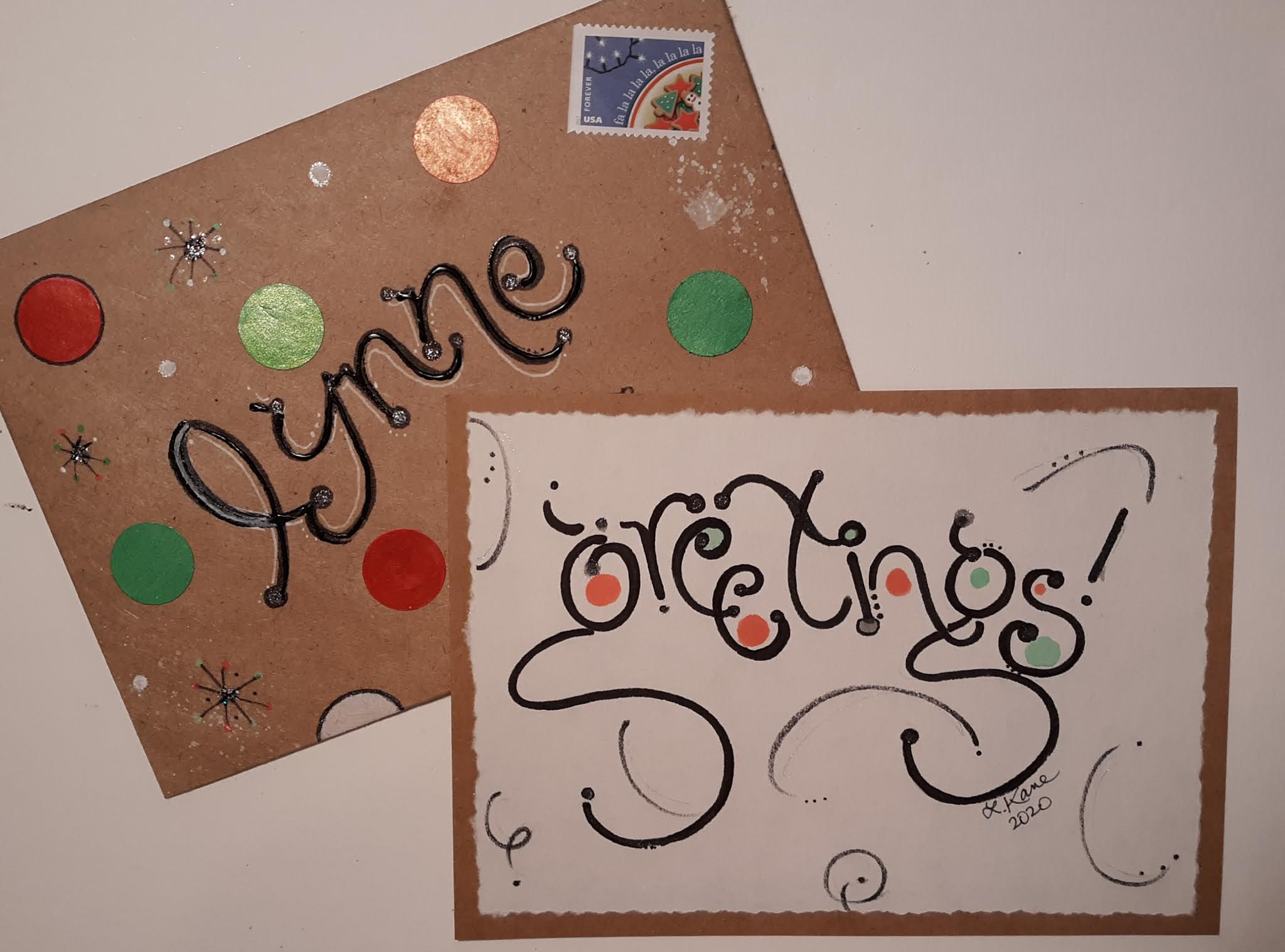
One to Leanne, as she commented on ig that she liked (and hoped one would come her way).


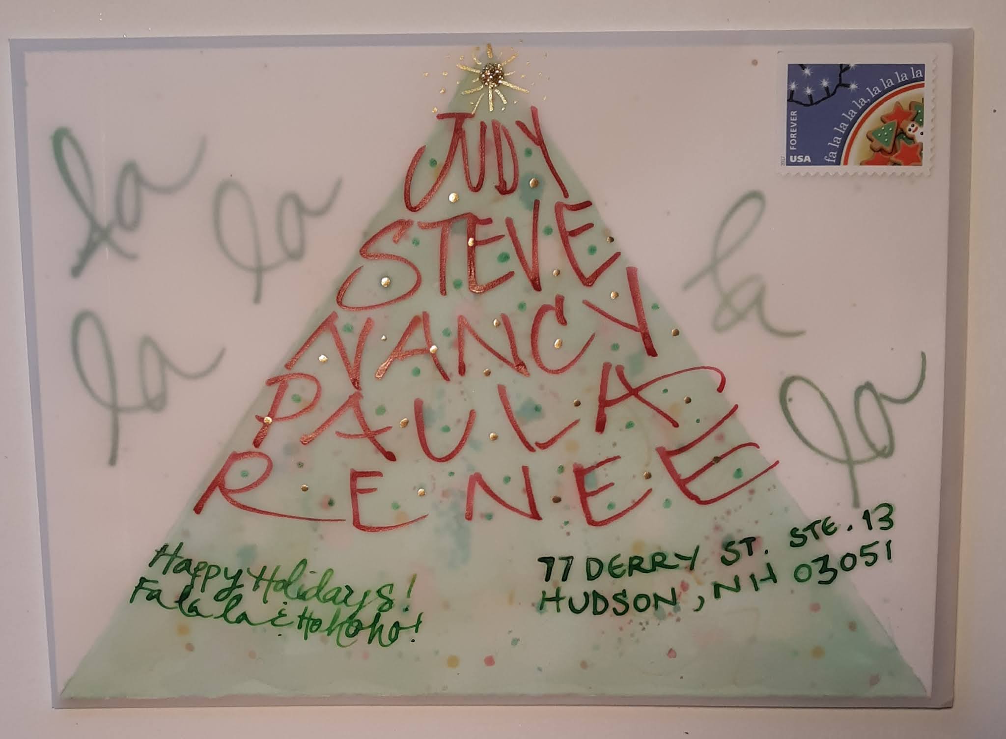
To the employees at the NH po. Hate that I messed up Judy's name, but I spent so much time on the env. I didn't want to redo. (so, I tried to cover up with folded pen lettering)


Some close-ups:


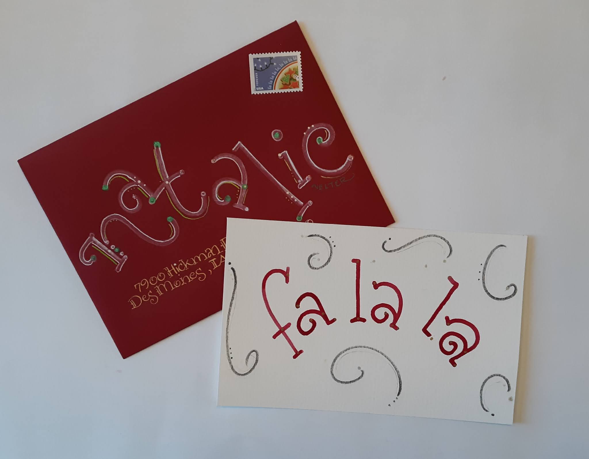
I love this paper! Bought it years ago for scrapbooking (which I don't do anymore, as I moved everything online!) I almost got rid of it, but then decided to try and make envelopes with it. So fun.


Holly to Natalie

New (poss. ongoing) PO worker, Natalie at the DM PO 

I don't have any good postage stamps so she got one of the new "Innovation" ones. I don't like that they're shiny, but at least it matches!

Did this as a fold over card (wc paper folded in half). You can barely tell, but I embossed the leaves and berries. (See next pic)