I've been very fortunate to have received some beautiful, lovely, fun creative envelopes over the years. Here is a sampling of some of my faves from when I first started (early 90's) to the early 2000's (before i got back into exchanging regularly in 2018). I just wish I could find my very first one sent to me. It was a brown craft env. with nice foundational black lettering (name and address), from a gentleman named Chris? -- he "headed up" the initial exchange.
I tried to put these in order, but I cannot remember, so I went by the date and addresses. First grouping is from early 90's (Maryland Pike address).

I've always loved this one! I love how the name is lettered big and the colors with the background. I just always thought it was so fun. There's just something about it.

These are all grouped together because of their "match the stamp" theme.
(L to R, Top to B: 1. a geometric tulip to go with tulip in stamp, 2. a hand drawn rose to match rose stamp, 3. Applique boot to match western theme of stamp, 4. Colors in name and address match stamp, and 5. Dr. Seuss theme.)

Cmas themed one. Lovely lettering. (even the printing. So jealous.)

I love how they did my name. So fun.
.JPG)
Not a pink theme, but again, Match the Stamp!
(These are all with color -- either the envelope or ink used.)

Again, love how they did my name -- Fun!
Wish I knew what they used, but I'm thinking some type of Crayola "overwriters" (or bleach?)
This could easily be re-created with marker and white Poscas.

BEAUTIFUL brush lettering (love the color!) And fun with my last name lettered over in pp.

So Gorgeous! Virginia did wonderful envelopes like this. I'm so lucky to have gotten a few from her!

Love this white tie-dye looking one! Wish I knew what they used.
Maybe drop-in colors? I'll have to try.

Fun versals. Love the matching color to the env.

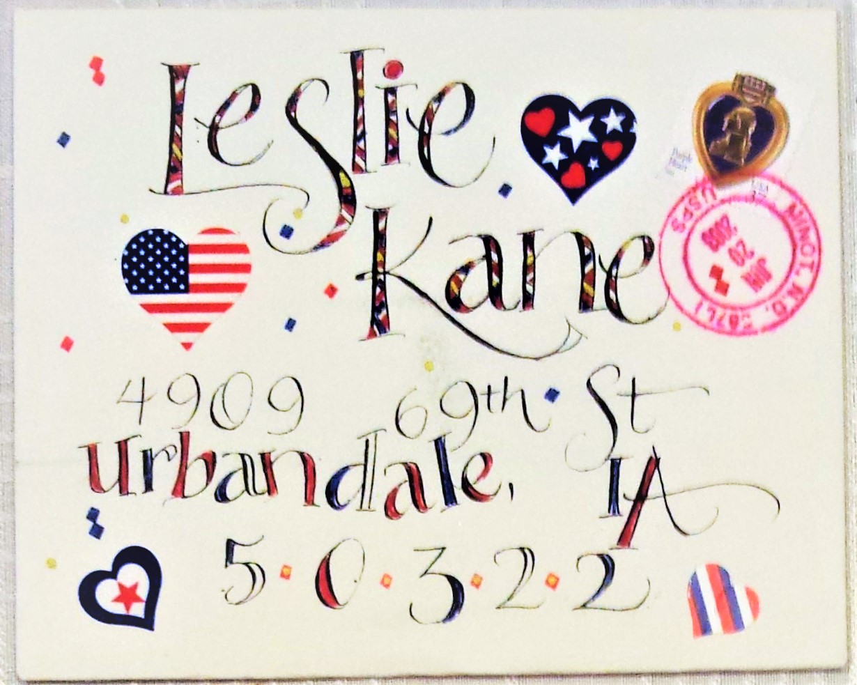
Very fun July 4th one. I believe this is from Pat Zink. She always did fun lettering. This is very steal-worthy -- I actually tried to emulate it one year (but mine was a fail).

Lovely and creative.

Lovely V-Day themed one! (Wish you could see the stamp better.)

I love this one so much -- such pretty colors, and lovely lettering.
This one is so steal-worthy b/c of the colors and design elements. Plus the stamps matches as well.

Love this bright one with the green lettering. Plus, she hole-punched the stars! (wonder how, unless she unfolded or it was a sheet of paper first?)

Fun Colorful Rubber Stamps.

Love the big lettering!

These are all so lovely in their simplicity (See Simple Samples page). Great examples of how less is more.

This magical one is from Glen E. I was lucky to take his RW workshop, AND to receive 2 fun envelopes from him. The cap letter is a wonderful example of one that looks like a design in itself.
So fun and inspirational.

And here it is with the enclosed letter. So fun.

Another from Glen. I call this "abstract lettering overlay" because it's my name, but it looks like a design element as well. So fun! (I borrowed this idea for a few of my envelopes):

Not an env., but this is my name lettered by Glen. I got it at his Ruling Writer workshop I took in '93.
*See my Folded Pen blog for more about this tool: https://foldedpenfan.blogspot.com/
----------------------------------------------------
These next few are from the mid-90's to early 2000's (69th St. address):

Lovely Paste Paper. Such pretty colors.

One of Judy Hovde's superb creations (I LOVED her envelopes!)

Fun colorful name idea. This is one of those simple, easy ideas when you're not sure what to do. Easy to match with stamp colors too.
Fun July 4th themed env. from Judy Hovde! (I tried to dupe once.)

Love how they matched the colors in my name to the stamp!

Another fun one from Judy.

And another! (Judy and I actually exchanged regularly for awhile in the early 2000's. I cannot remember how I found her, but I contacted her to see if she wanted to exchange, as I was looking to exchange with those focused more on lettering and intermediate levels.)

This one is pretty cool, and prob. a bit time-consuming, as the paper in interwoven.

Again, an easy sample but so fun! Love the outline and foundational (Bone?) lettering, plus the colors.

More lovely brush lettering! Again, one of Judy's.

Lovely details on each letter.
----------------------------------------------------------------------------------------
And these last few are from the mid 2000's (2004 & on):
*Most are probably from year-long exchanges.

Love the varied letter forms of this.

This is so pretty and lovely. Great paper colors.

There's something about brown craft env.'s...not sure what, but just kinda cool.
I love the simplicity of this. The black, the grid lines and the gold accents.

Lovely L cap and colors.
%20(1).jpg)
This is fun with how the letters are intersected, and I also like the colors.

A fun decorated cap. July 4th theme, and I love how it looks like the top is shooting out fireworks. Wonder if that was intentional?
.jpg)
I thought this one is so fun (the decorative ink). Abstract flower garden?

Lovely versals.
This is it for the older ones. I probably took a good 10 year break (maybe?) from exchanging. Not sure why (burnout?) BUT am so glad I am back at it! I started up again in the early fall of 2018, and was lucky not only to find Jean's blog, but to acquire some regulars as well!
*Be sure to check out my other pages for tips, ideas & more samples!
No comments:
Post a Comment
Note: Only a member of this blog may post a comment.